Cases · Community space · Pesaro, Italy · 2025–2026
Il posto delle fragole.
Four organizations, one place for the young people of the San Martino neighborhood, no shared identity. The Specula method told through a real case.
The situation
ARCI, LiberaMusica, Cooperativa Labirinto and Fondazione Wanda di Ferdinando are building a new community space for young people. There is the place, there is a working group, there is commitment. But each partner brings different histories, mandates and visions.
The risk is the usual one: a space defined by the sum of its services (kitchen, music room, workshop, events) instead of by its character. A brand able to list activities, but not to say what kind of presence it wants to be.
Everything starts from a founding question, simple and radical: "how does it feel to be here?" If a choice doesn't improve how it feels to be here, it's not the right choice.

Before
A place with many possible activities, four organizations involved, shared but still descriptive values, the risk of becoming a generic container.
After
An identity able to say what's in and what's out, a matrix of operational values, a dynamic visual system, a quarterly governance that keeps drift at bay.
The uncomfortable question
What must this place
never become?
Every identity is also born from a refusal. Not only from what it promises, but from what it decides not to legitimize.
Phase 2 · Brand Archeology
The tension that
holds everything together.
In the material from the co-design workshops, the strongest polarity was between care (protection, welcome, warmth) and innovation (technology, experimentation, the freedom to try and fail). A simpler process would have resolved it by choosing one pole.
The Ethical Gate asked another question: is it a contradiction to be resolved, or a productive polarity to inhabit? The answer redefined care: not protection, but an infrastructure that enables. Psychological safety is what gives the courage to try, fail and invent: not its opposite.
The space doesn't choose one pole: care becomes the infrastructure that makes the freedom to experiment possible. From a welfare space to an enabling space.
Phase 2 · From descriptive to operational
Values that decide,
not that decorate.
The co-design had produced rich but descriptive values. Brand archeology translated them into governance rules: sentences that decide, not decorate.
Phase 3 · Ethical Gate
The boundaries that
protect the identity.
The brand also defines what it doesn't want to legitimize. These refusals are written, binding, consultable.
- Measuring success only by attendance numbers.
- Programs where adults count more than young people's ownership.
- Language reassuring for adults but unrecognizable to fifteen-year-olds.
- A brand that promises performance instead of presence.
Phase 4 · Narrative Synthesis
An identity able
to change state.
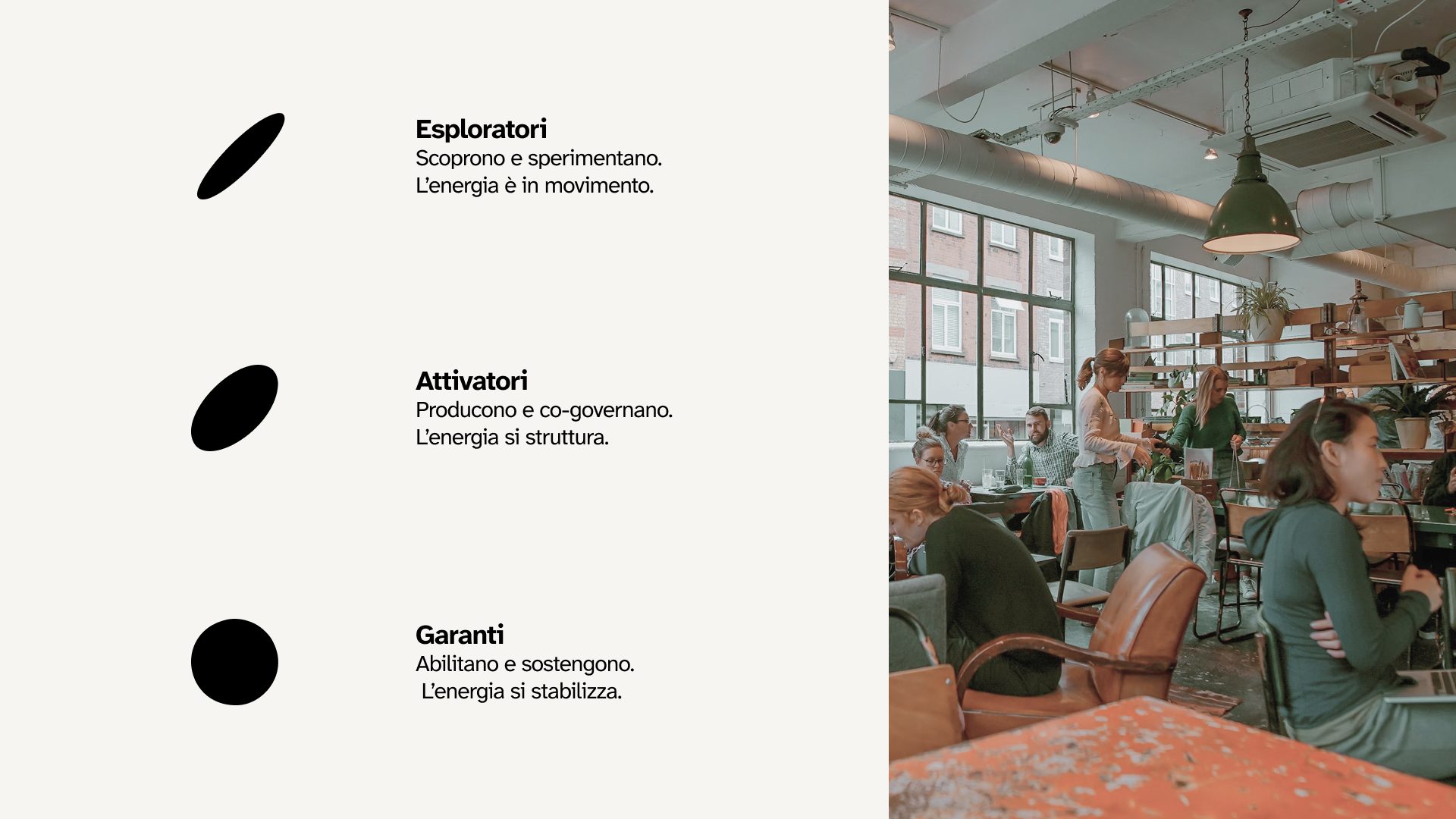
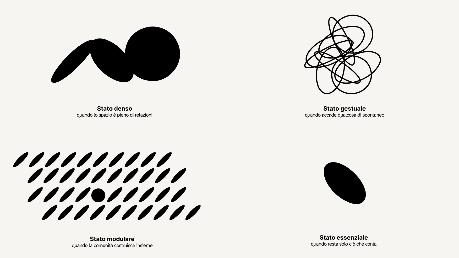
The identity is not a container of activities. It is an organism: it changes shape when the life of the space changes, but keeps the same character. Its visual identity moves through four states, and it moves without dissipating.
Black and Dirty White are the primaries: they carry the founding elements of the identity (logo, text, surfaces). Sand, Green and Red are the expression of the intersection states, used where activities and people meet. Color is not there to get noticed: it's there to make the space work.
Atkinson Hyperlegible Next
ExtralightLightRegularMediumSemiboldBoldExtra-Bold
Aa Bb Cc Dd Ee Ff Gg Hh Ii Jj Kk Ll Mm Nn Oo Pp Qq Rr Ss Tt Uu Vv Ww Xx Yy Zz 1234567890&@
Atkinson Hyperlegible Next is designed for legibility: it reduces ambiguity between similar letters and improves visual clarity, ensuring accessibility and inclusion for people with low vision as well. A choice that weaves together form and values: here legibility is a form of care and non-judgment, the same principle that guides the space.
The things
When the community
becomes the medium.
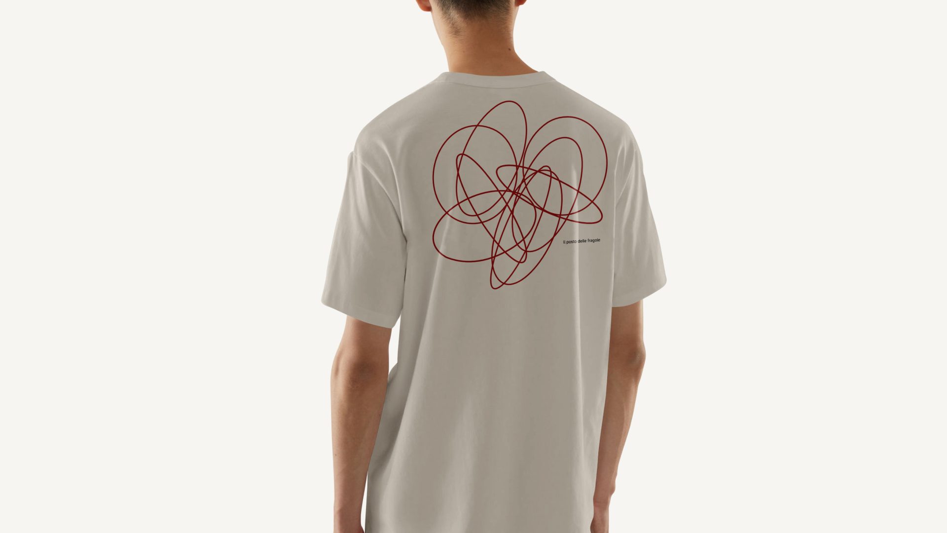
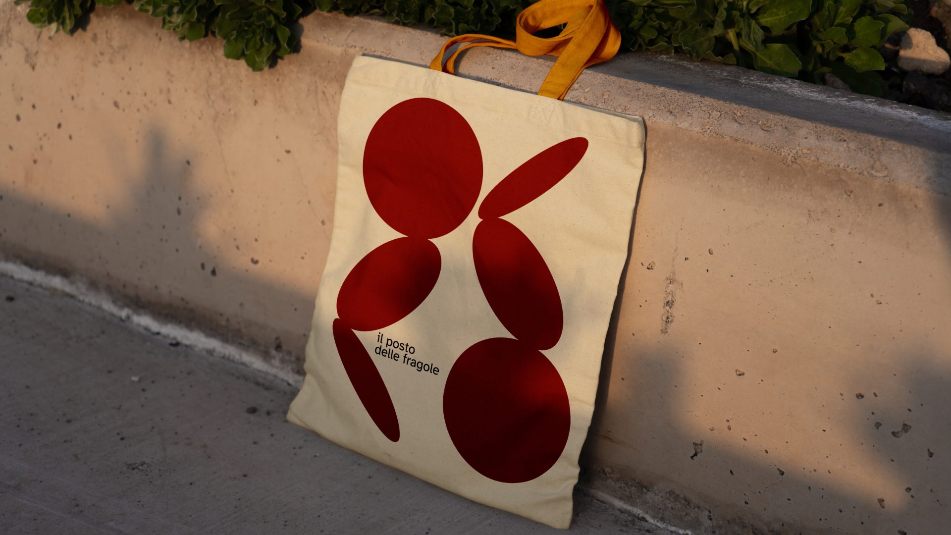
The system doesn't live only in documents: it is worn, it moves around the neighborhood, it ends up in shopping bags. The gestural state on the t-shirt, the full mark on the tote. The community becomes the medium.
Phase 6 · Governance
Without governance,
every identity drifts.
When an identity works, it's easy to think the job is done. In reality that's where the most delicate work begins: taking care of it, day by day. On its own, even the most beautiful identity doesn't choose in people's place.
That's why the brand is not a document to archive, but a living identity: a core that stays firm while everything changes, and a part that can evolve without betraying who they are. Every quarter the Radar stops to listen to the distance between what the space says about itself and what people actually experience.
- Commercial drift. Choosing based on what brings revenue now, even when it's not coherent.
- Identity drift. Telling one story, while those who walk in experience another.
- Community drift. The community stops participating and becomes a passive audience.
The question that starts everything
Is there something this place should never become,
even if it brought resources and visibility?
The outcome
Not a logo.
A governance.
Without the method, the four organizations would have produced a reasonable shared brand: a logo, a palette, a mission. The Specula Method produced a governance system for the identity.
When a new proposal arrives, the matrix of values says whether it's in or out. When communication choices emerge, the tone-of-voice axes define what's allowed. When the space evolves, the living system lets it change state without losing itself. The brand decides, it doesn't decorate.
Co-design facilitation: Sineglossa. Brand identity and strategic synthesis: Specula Future Crafting. Period: October 2025, February 2026.
Your identity also has a tension to inhabit.